October 2016
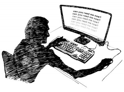
How the Web Became Unreadable
“I thought my eyesight was beginning to go. It turns out, I’m suffering from design”, says Kevin Marks at backchannel.com.
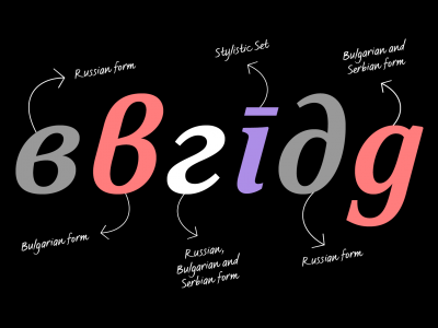
Cyrillic script variations and the importance of localisation
Not all Cyrillic languages use exactly the same characters as Russia – find out about the difference in this blog post by Krista Radoeva.

Kazimir font is inspired by type errors in early Russian printing
Angela Riechers about Kazimir and Kazimir Text by Ilya Ruderman and Yury Ostromentsky (CSTM Fonts). Via AIGA Eye on Design blog.

New release – the dramatic Fino
Fino, Ermin Međedović’s latest type system, is a dramatic, contemporary family that scales beyond the world of looks by tapping into archetypes. (more…)
Christian Miller – Designing future-proof UI
Thoughts on why UI has a limited lifespan, and potential measures we can take to ensure designs have longevity.
Why website body text should be bigger, and ways to optimize it
Christian Miller explains why your body text is too small and features 4 reasons why to design with bigger body text.

The most incredible microscope images of 2016 reveal a beautiful, hidden universe
The world we see with our eyes is just one view of reality, but microscopes can bring a smaller, practically invisible universe within reach. Via Business Insider UK.

Transit Maps vs. Apple vs. Google
A transit map is much more than a list of stations. It’s the underlying anatomy of your city. It shows how people move, how neighbourhoods are connected, and how your craziest city adventures begin.
(more…)

Mala, a new type family by Barbara Bigosińska, Bold Monday
Mala is inspired by and geared to cartography and the design of maps, but by far not limited to that realm. The distinct condensed and extended styles — all including special decorative swash capitals — make the family versatile beyond structured text and labels and enable compact as well as lavish, exuberant display typography. (more…)

Francis, a highly modulated sans-serif by Typotheque
Francis is a narrow sans-serif typeface with warm details and dramatic modulation of thick and thin strokes, ideal for creating strong headlines. (more…)