Rules
Tag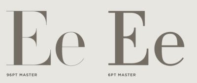
Optical and size-specific fonts
All typefaces are designed with a specific size range in mind – usually text or display. Learn more from about opticals from Ilene Strizver (Creative Pro).

The Typographic Desk Reference, 2nd ed.
A reference guide of typographic terms and classification with definitions of form and usage for Latin based writing systems. The TDR is an encyclopedia, listing countless entries on the typographic arts. (more…)

What do font names actually mean?
Thin, Light, Regular, Medium, Semibold, Bold, Extrabold, Heavy, Black… What does it mean? Via YouWorkForThem

Type Terms, the animated typographic cheat sheet
If you are new to typography or here to refresh your memory, then Type Terms is the perfect tool for you.

Jonathan Hoefler – How to use clashing fonts
Designers are trained to believe that similar typefaces should never be used together. But breaking this cardinal rule can sometimes be the perfect way to create ordered, elegant typography. Here’s how.

Combining Typefaces – Free guide to great typography
Originally published by Five Simple Steps in 2013, my Pocket Guide to Combining Typefaces, now available for free here on the Typekit blog.

Typography tips for a better user experience
Here’s a list of 5 easy ways to improve the typographic quality and effectiveness of any website, email, or digital product design. (more…)
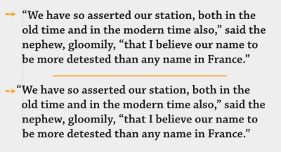
Hung punctuation & optical margin alignment
To hang or not to hang – punctuation, that is. Ilene Strizver explains the terms hanging punctuation and optical margin alignment.
What to watch out for when mixing type
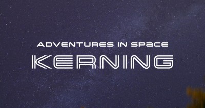
Adventures in Space: Spacing and Kerning
Spacing and Kerning, the first two articles in a series about space in typefaces. By Yves Peters, published by FontShop blog.