February 2017

Newspaper Club – 11 creative uses for newsprint
Newspapers aren’t just for news anymore. In fact, newsprint is one of the most versatile formats out there – it can feel familiar and experimental, sophisticated and DIY, all at once. Via People of Print.

TYPO Berlin 2017, International Design Conference
The early-bird registration phase for TYPO 2017 ends in a few days. Look at the complete programme.
Typography for user interfaces
Our interfaces are written, text being the interface, and typography being our main discipline. A guide by Viljami Salminen.

Typographics festival’s schedule is online now
Typographics is a design festival for people who use type. The event series takes place June 12–22, 2017, and is devoted to contemporary typography, with talks, workshops, and tours focusing on where typography is today and where its future may lie. (more…)

Grammy goes to Jonathan Barnbrook
Jonathan Barnbrook has been awarded the Grammy for Best Recording Package for his artwork for David Bowie’s ★. Via It’s Nice That.
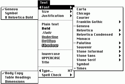
The three phases to improve your typography
Cultivating an eye for typography can be challenging to designers first learning. TypeThursday sat down with Wenting Zhang, creator of TypeDetail, to talk about the steps in improving your typographic skills.

Here’s how Adobe introduced Illustrator 1.0 in 1987
30 years ago, Adobe launched what has been the most popular professional vector art and design software. Get nostalgic while you watch the videos Adobe released for its launch at Digital Arts.

Mouvo motion design festival starts next Friday
Mouvo is the first Czech festival presenting motion design in all of its forms. 17–18 February 2017, Archa Theatre, Prague, Czech Republic. Hurry up! Last few tickets on sale!

2016 – A year in review by Sébastien Morlighem
“Although 2016 was marked by pressing environmental, political, economical and social issues that seemed to spiral into crisis, it is safe to say that the type community continued to thrive.”

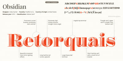
New font – geometric sans Noka by Blackletra
Noka is a powerful display geometric sanserif with a lot of personality. Its clean structure refers to a more digital and technological atmosphere. Designed by Daniel Sabino, Blackletra.