March 2015
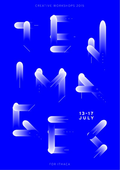
Ten Images for Ithaca 2015
Join the design and illustration workshops Ten Images for Ithaca in one of the most beautiful Greek islands. Focused on graphic design, illustration and photography, Ithaca, 13–17 July 2015. (more…)
Magazine of the Week: MC1R #2
magCulture reviews MC1R, a magazine for red-heads. Written by Madeleine Morley. (more…)
Typography Cheatsheet
Typewolf offers a comprehensive guide to using proper typographic characters, including correct grammatical usage. Online and Printable 1-Page PDF.
Parentheses, Braces and Brackets
Ilene Strizver, founder of The Type Studio, explains the differences between parentheses, braces and brackets at Fontology.
The character set of a typeface includes a broad range of punctuation marks. Among them are parentheses, braces and brackets. These three pairs of symbols all serve to enclose additional information – words, numbers or symbols – generally not essential to the meaning of the sentence or paragraph. Although all three marks share this function, they have specialized usages as well.
Via Fonts.com
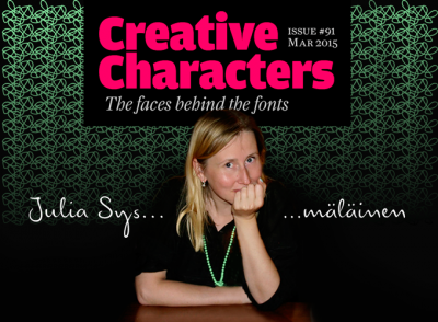
Creative Characters Interview with Julia Sysmäläinen
Julia Sysmäläinen is Finnish type designer with a Russian mother, living in Berlin, Germany. (more…)
Read the whole first year of Printed Pages magazine online now
Good news everyone, you can now get access to the Printed Pages archive online! Printed Pages is an art and design magazine which focusses on depth and discovery, combining engaging and accessible content with top-notch design values. (more…)
Graphic Means: A History of Graphic Design Production
Graphic Means explores the history of graphic design production, before the advent of the desktop computer. This project will only be funded if at least $25,000 is pledged by (more…)
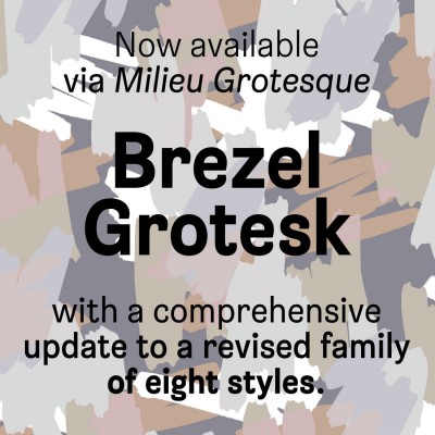
New font: Brezel Grotesk
Brezel Grotesk, originally designed by Stefanie Preis in 2010, was recently refined and further developed by Milieu Grotesque. The revisited family comes in eight styles in total (four weights with corresponding italics), each style comprises an extended Latin character set and a number of basic OpenType features. (more…)
Women in Design: Slávka Pauliková
Another interview from the FontShop series Women in Design. Slávka Pauliková is a type designer born in Slovakia. She studied at the Type and Media masters course at the Royal Academy of Art in The Hague.
After graduating at the KABK Slávka Pauliková had the typeface she created at Type & Media quickly picked up by FontFont and released as FF Dora. She took some time out of her busy schedule to speak to us about eBooks and living all over the world.
Other Notable Font Releases of 2014
Other Notable Font Releases of 2014 are part of the Typographica review “Our Favorite Typefaces of 2014”. In this section, there are notable fonts which didn’t make it to the main list.
Think of this collection as a sort of “editor’s picks”. These are the typefaces that I personally felt were worthy of selection — they just didn’t happen to be among the writers’ favorites.

