August 2016
protoTypo – promoting speculative type design
Check the complete results of the protoTypo type design competition. The best of show winner is Audree by Nikola Djurek.
The mysterious ancient origins of the book
The debate about ebooks v paper books is nothing new. Keith Houston explains how a very similar debate raged as the first books came to be in ancient Rome.
Why handwriting is still essential in the keyboard age
There is a tendency to dismiss handwriting as a nonessential skill, even though researchers have warned that learning to write may be the key to, well, learning to write. (more…)
A comprehensive guide to font loading strategies
Pros and cons of different font loading strategies. By Zach Leatherman.
The perception of black & white and the effect of contrast
En essay on the ‘black’ and ‘white’ in typography by Ferdinand Ulrich. Published at FontShop Blog.
18 confusing typographic terms explained
Typographic terminology is sometimes very specific, and the nuances can be confusing. Understanding the distinctions will enable you to communicate more clearly, typographically speaking, and help you to make the best use of your fonts and software. (more…)
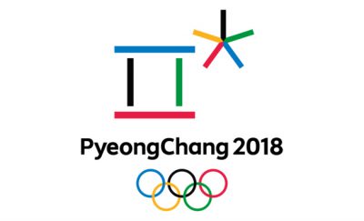
Milton Glaser analyzes Olympic logo design through the ages
BITS 6, typographic & type design conference
The conference will be taking place between 7–9 October 2016 at Goethe Institut, TCDC, TAB and W Hotel Bangkok, Thailand.
Identitytool for Sweden
The online manual is aimed at people who work with ‘Brand Sweden’. Check the principles, logos, fonts, colours and patterns.
Try Shape Type, a letter shaping game
Train your Bézier curve skills at shape.method.ac. (Hold ⇧ to snap to the axis, ⌥ for a quick preview.)


