July 2017
TDC medal awarded to Dutch typographer Gerard Unger
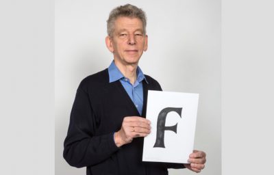
The Type Directors Club has presented the prestigious TDC Medal to Dutch typographer Dr. Gerard Unger to recognize his accomplishment in creating some of the world’s most influential typefaces for over the five decades.
The new face of Letterform Archive
Tânia Raposo and Nick Sherman describe how they took on the challenge of representing 40,000 objects in a single visual identity.
Evolution of the LEGO logo
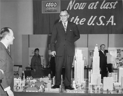
The red, white, yellow, and black LEGO logo is synonymous with one of the world’s largest toy manufacturers, but it didn’t always look so familiar. A story by www.logodesignlove.com.
Create your own hand painted sign
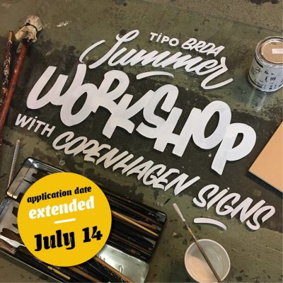
This summer Jakob Engberg, Founder of Copenhagen Signs, will give an extended Sign Painting and Lettering workshop in Slovenia. The 7 day workshop will take you through the basics of hand lettering, brush lettering and sign painting techniques. You will end up with your own hand painted sign on your own custom cut wooden panel. (more…)
Dan Rhatigan on variable fonts and the future of typography
“The likelihood of a variety of new approaches to application UI both excites me and scares me a little.” Read the interview by Khoi Vinh.
The German capital letter Eszett
On June 29, 2017, the Council for German Orthography endorsed the optional use of a capital sharp s (ẞ). Written by Christoph Koeberlin.
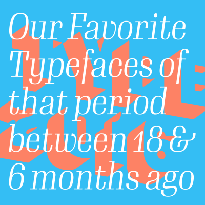
Typographica’s Favorite Typefaces of 2016 revealed
“These selections are made by graphic designers, type designers, educators, and enthusiasts who have a peculiarly acute eye on the type scene, capable of spotting worthy needles among the haystack of thousands issued every year.”
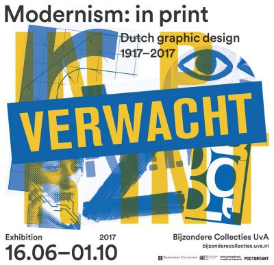
“Modernism: in print” exhibition in Amsterdam
From 16 June through 1 October, the Special Collections of the University of Amsterdam will be showing the exhibition “Modernism: in print”. It is the first retrospective exhibition of modernism in Dutch graphic design.
Exchange, new font family designed by Tobias Frere-Jones
Originally designed for newspaper text, Exchange strives for clarity and efficient copyfit across multiple platforms.
4 things every graphic designer needs to know about Cyrillic
For anyone who is used to the Latin script, Cyrillic looks familiar and foreign at the same time – so many seemingly flipped Latin letters, a lowercase that looks more like small caps… A story by Krista Radoeva.

