
Typography
Category
“It’s time for the Swiss style of typography to bow out.”
Is This the Answer to Helvetica, a.k.a. the “Lazy” Design Choice? An interview with Bruno Maag by Luc Benyon, AIGA Eye on Design blog.

Hilarious examples that show why letter spacing is important
An incorrect space – or the lack of an appropriate one – between words and letters can make or break even the most eloquent of texts. Via Bored Panda.

Five fresh headline & body text pairings on Google Fonts
Jeremiah Shoaf revisited Google Fonts library with the hopes of uncovering some new and interesting typeface pairings. Check the five favorites that he discovered.

So you want to apply to TypeMedia?
James Edmondson: “Taking a year off to study typeface design in another country, under a few of the world’s premier type designers sounds great, right? Well it is! But it’s not all fun and games.”

Punctuation series – the pilcrow
Fernando Mello explains the pilcrow or paragraph symbol, also known as the alinea or blind P. It is used to represent individual paragraphs in a piece of text.
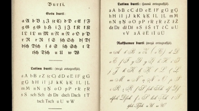
Diacritics as a means of self-identification
The Case of Latvia – Aleksandra Samulenkova’s talk on Latvian diacritics from the 2016 ATypI conference Warsaw.
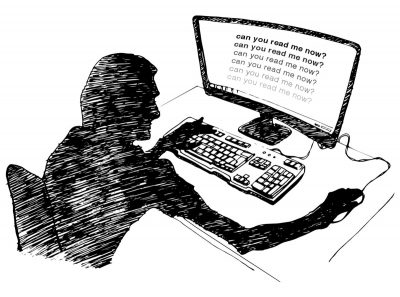
How the Web Became Unreadable
“I thought my eyesight was beginning to go. It turns out, I’m suffering from design”, says Kevin Marks at backchannel.com.
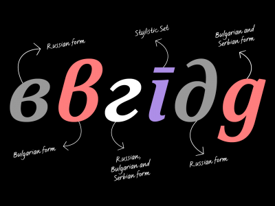
Cyrillic script variations and the importance of localisation
Not all Cyrillic languages use exactly the same characters as Russia – find out about the difference in this blog post by Krista Radoeva.

Why website body text should be bigger, and ways to optimize it
Christian Miller explains why your body text is too small and features 4 reasons why to design with bigger body text.

Type specimens on the web, an interview with John D. Jameson
How type is promoted on the web is changing. This week, Typethursday chatted with front-end developer John D. Jameson. They discussed how specimen websites have changed and how to make your promo site more effective.