United States
Tag
The new face of Letterform Archive
Tânia Raposo and Nick Sherman describe how they took on the challenge of representing 40,000 objects in a single visual identity.
Type Over Time by Type Directors Club
The Type Directors Club is pleased to announce a celebration of its 70th anniversary, a day-long series of typography talks and an evening reception. 10 March 2017, 9:00 am–6:30 pm, SVA theatre, 333 W 23rd Street, New York, NY 10011, United States.

Every NY Times front page Since 1852 in under a minute
This visual timeline by data artist Josh Begley captures the storied newspaper’s approach to layout and photography by incorporating every NY Times front page ever published into a single one-minute video. Via This is Colossal.

Typographics festival’s schedule is online now
Typographics is a design festival for people who use type. The event series takes place June 12–22, 2017, and is devoted to contemporary typography, with talks, workshops, and tours focusing on where typography is today and where its future may lie. (more…)
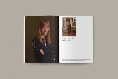
In praise of slow – on the Kinfolk redesign
The redesign of Kinfolk seeks to distance the title from its legion of imitators, while offering a deft balance between evolution and familiarity. By Mark Sinclair, Creative Review.
An interview with typeface designer Nina Stössinger
Typeface designer Nina Stössinger answered several intriguing questions put to her by TDC board member, Elizabeth Carey Smith — how she began, what gives her inspiration, her recent move to New York, and which letters are “pepperminty.”

Retina, new release by Frere-Jones Type
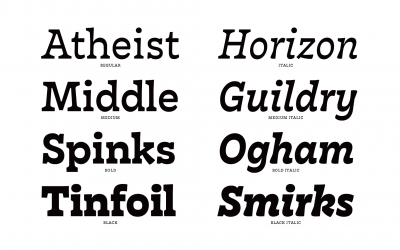
The second release from Frere-Jones Type is here. Retina combines years of legibility research and a broad range of proportions for a family that is both clear and capable.
New font – Chronicle Display
Six new typefaces born of fashion, and designed for all kinds of dramatic visual storytelling. Meet the bright and graceful Chronicle Hairline collection: romans and italics in Regular, Condensed, and Compressed.
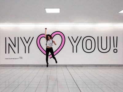
JFK, Terminal 4 rebrands itself
Base Design crafted an identity for JFK’s Terminal 4, showing how spatial branding can improve a harrowing user experience. (more…)

Film – the last day of hot metal typesetting at the New York Times
Typesetter Carl Schlesinger and filmmaker David Loeb Weiss documented the last day of hot metal typesetting in a film called Farewell — ETAOIN SHRDLU (the obscure title is poignantly explained in the film). (more…)